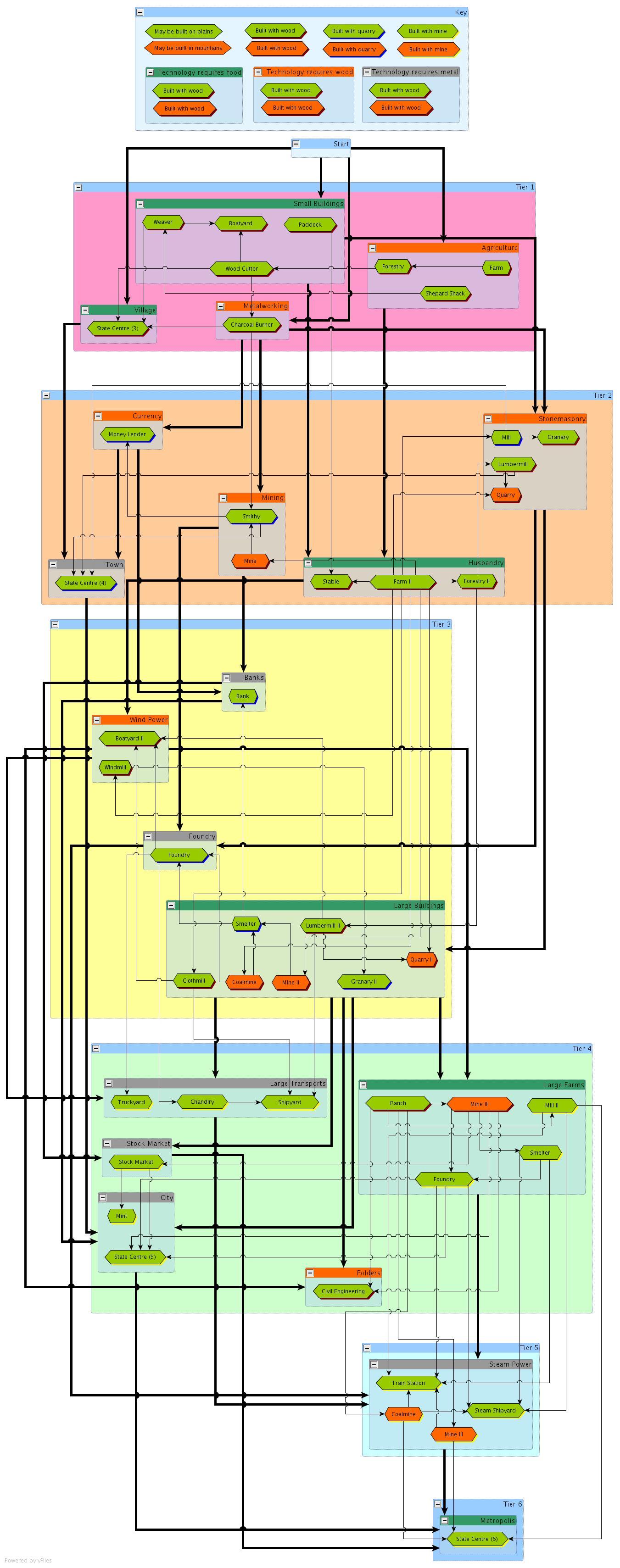
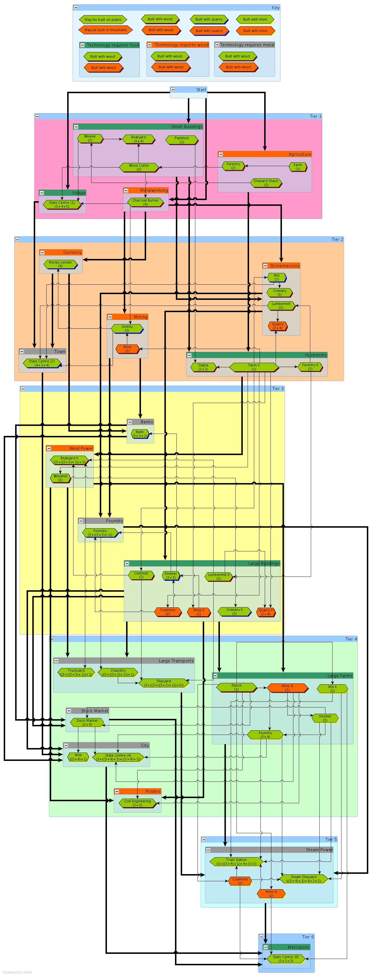
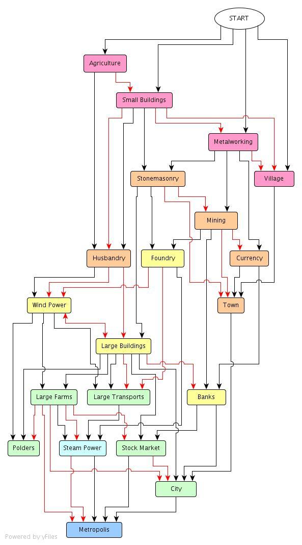
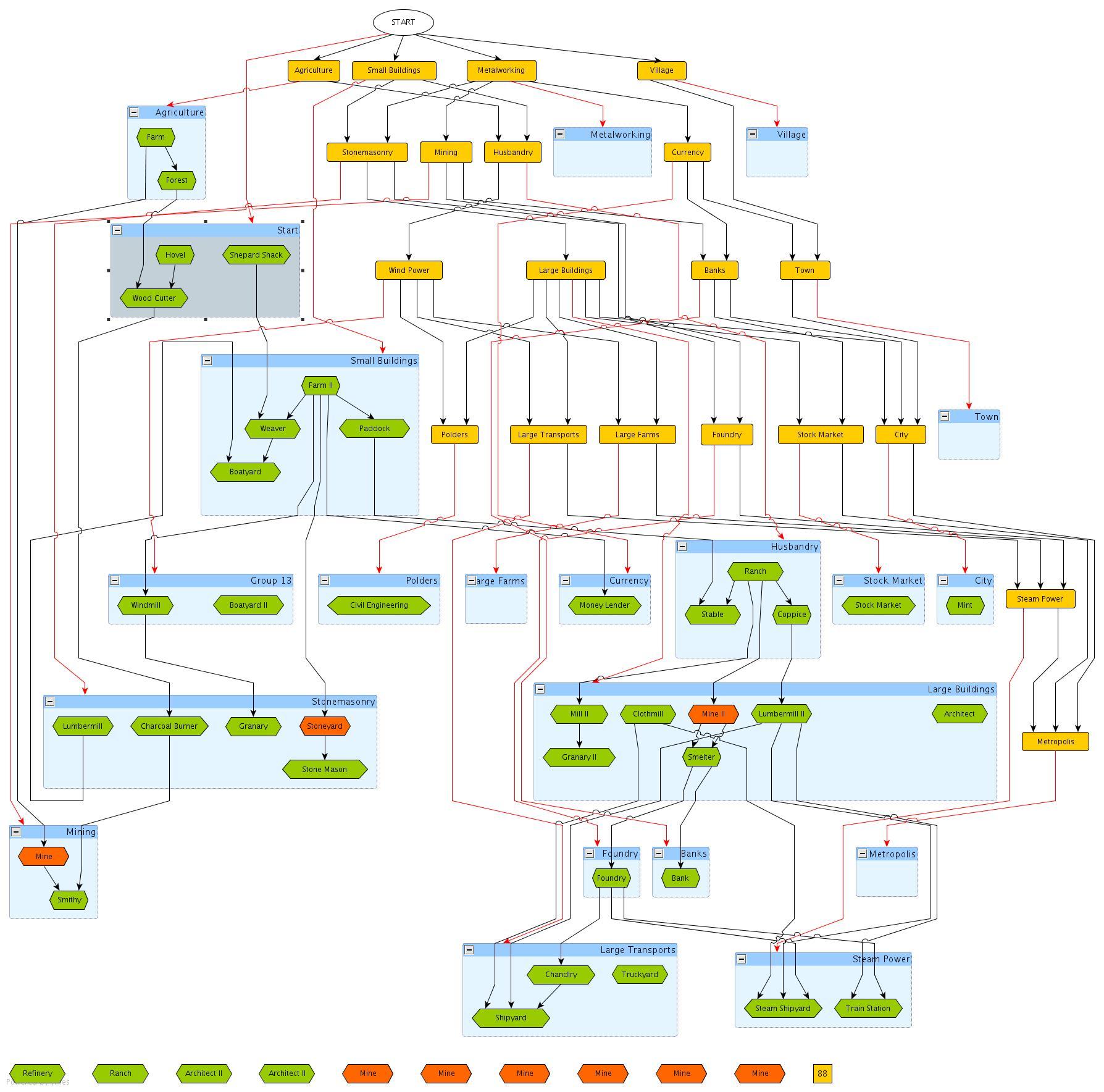
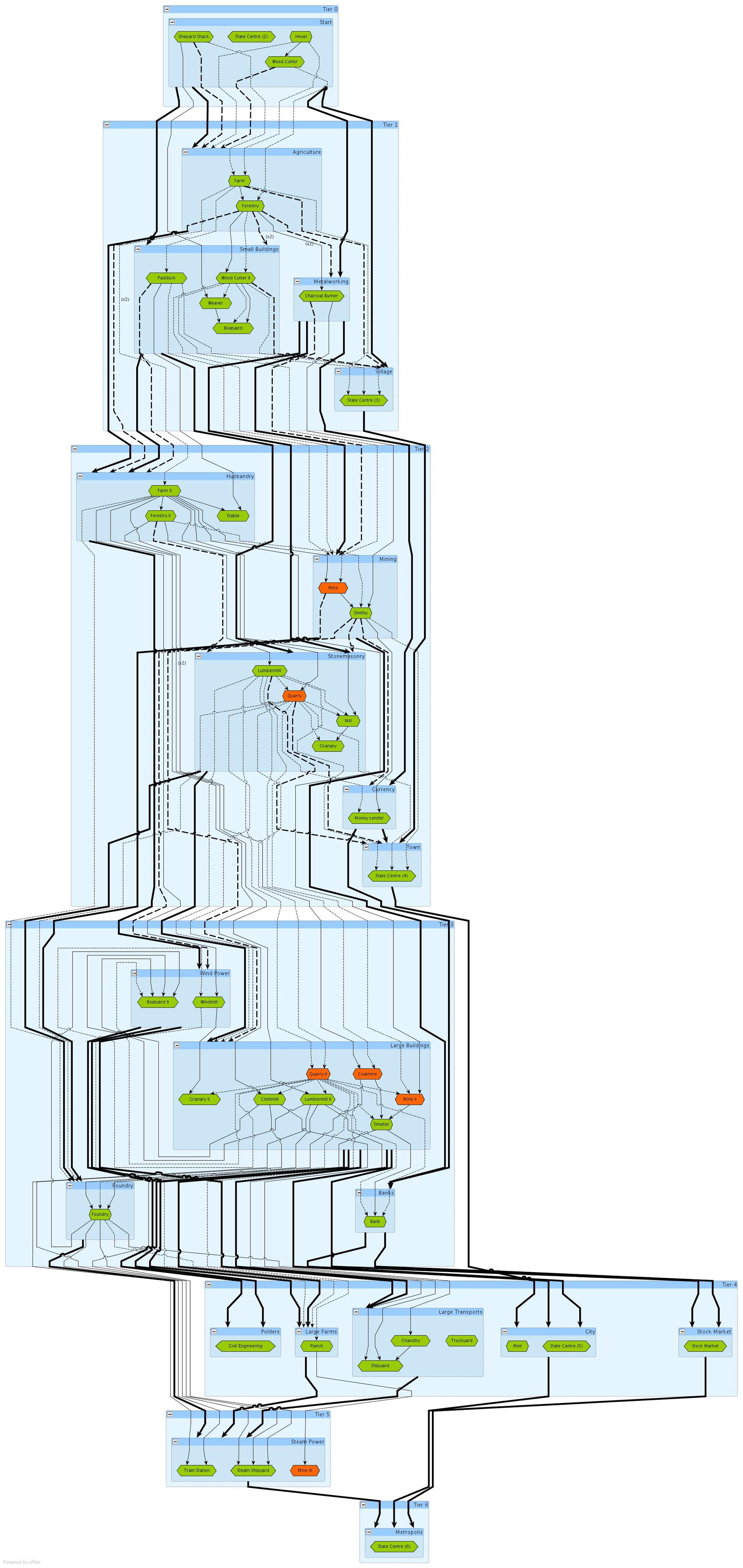
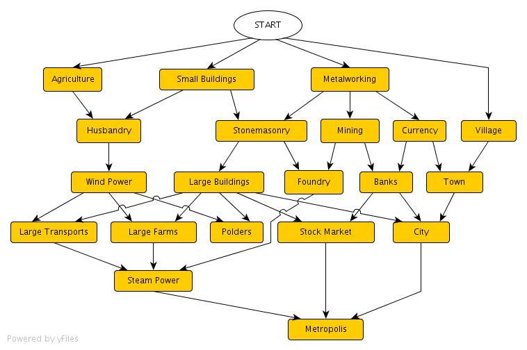
I added a secondary red graph to the technology graph which maps the inputs to the buildings within the various technologies. As the clear linear layering of the technology tiers was lost in the new display form I also coloured the nodes for each tier. The results are quite interesting and surprisingly close to what I’d expected. I’m specifically pleased that the tree orientation and node weighting has coarsely ordered the technologies and buildings into the order the players will generally want to build/research them, at the same time calling out the clearly ambiguous sections with nodes at similar heights. Nice.

Nando, I suspect unwittingly, persuaded me last night to lose the Tier 0 buildings. Losing them gives the game a faster start, possibly trimming around 30 mostly irrelevant minutes off the play time. A fair trade.
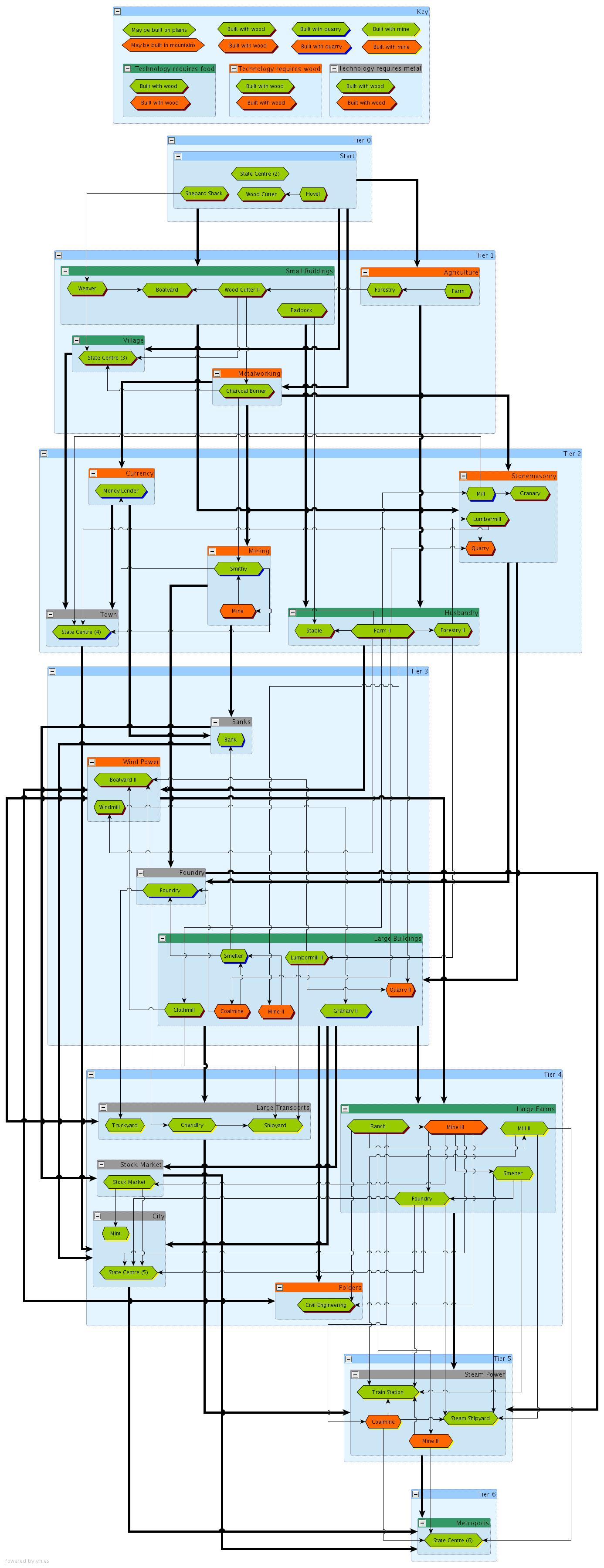
A similar colouring exercise on the building graph groups produced:
